


FRESH Fall 2023
ART DIRECTION / PORTLAND STATE
Branding and promotion for the biannual PSU Graphic Design graduation showcase. Designer Angela Nguyễn and I developed a fun, flexible identity to promote the event held at Nemo Design and highlight the graduating designers.
Art Direction, Photoshoot Art Direction, Production (Risograph Printing), Pitch Deck Design, Social Media Management


Best New Bands
PAGE LAYOUT / WILLAMETTE WEEK
The annual roundup of exciting new bands and artists in Portland by Willamette Week.
Art Direction, Photoshoot Art Direction, Page Layout


Mellow: Wine Bar
BRAND IDENTITY / SCHOOL
Mellow, a casual wine bar and community space has a wordmark that embodies the eclectic and the vibrant emphasizing that Mellow is a more casual version of your classic wine bar. The juxtaposition of a cozy calm name and a loud and energetic identity emphasizes its vibrant, easy atmosphere, and the broad system of collateral allows Mellow to become its own little world.
Art Direction, Logo Design, Menu Design, Printing + Production, Photography
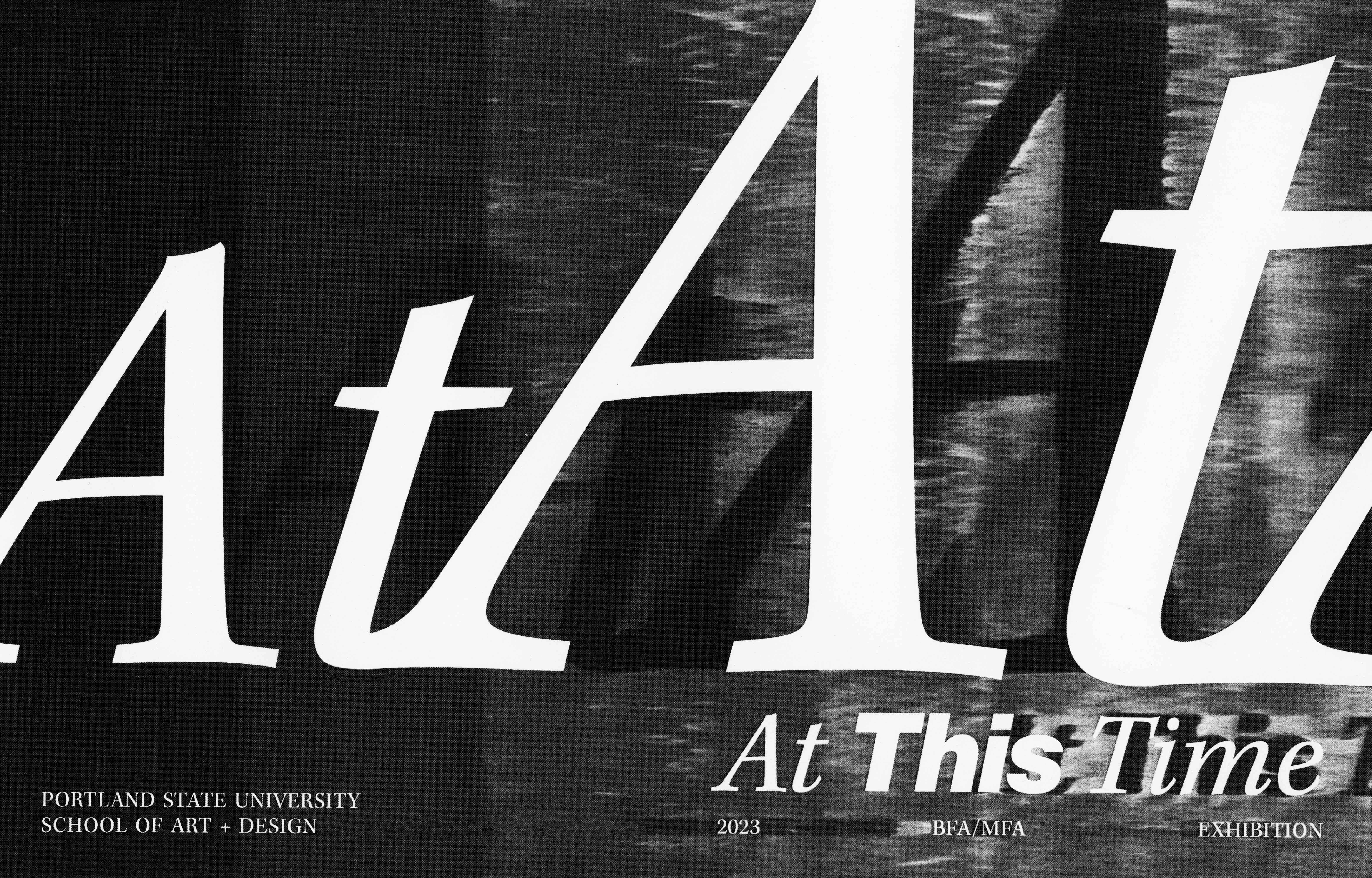

At This Time
EDITORIAL / CLIENT WORK
A catalog for the Graduation Exhibition for BFA/MFA Art Practices Students at PSU. This catalog features each graduating artist, with the goal of both highlighting their individual work while forming a cohesive, professional, intriguing, and balanced design. We tied together timeless, polished typefaces with slightly off-kilter layouts, introducing atypical movement to each page to marry the concepts of curiosity and sophistication.
Art Direction, Page Layout, Printing + Production
Art Direction, Page Layout, Printing + Production

REBEL Brochure
EDITORIAL / SCHOOL
Why would you want a brochure thats only a brochure? This Design Musem Brochure focuses on one upcoming exhibit: REBEL, 30 Years of London Fashion, and becomes a poster when you’re done with it rather than going into the trash. With high fashion in mind, I wanted this brochure to feel exuberant and a little bit brash, while maintaining a polished and meticulous attention to type detail to assure that the content had appropriate legibility and hierarchy.
Page Design, Image Treatment, Layout, + Printing


UNREAL Festival Catalog
EDITORIAL + POSTER DESIGN / SCHOOL
Nothing fits the speedy, shaky, anxiety laden style of the Safdie Brothers better than the gritty, grabbing force of tabloid headlines. Designed with tension and contrast in mind, this catalog mirrors the nature of the films it describes. This small but mighty book has a boldness that grabs the attention of passers-by and a variability holds their attention as they read through.


From Home
EDITORIAL / PERSONAL
A gift for my dearest friend when she moved away from home this past summer. A collection of letters from loved ones, designed to feel handmade and full of joy, with the gauze of nostalgia guiding the type, layout, and image manipulation. Four color risograph print.


Annex Zine
EDITORIAL / SCHOOL
The winter edition of PSU Graphic Design’s A+D Projects Zine, This Issue Doesn’t Matter is about everything and nothing. Designed to feel irreverent, messy, and a bit silly in an effort to make the meaningless meaningful and vice versa.


Be Honest Bar
BRAND ID + EXPERIENCE / PERSONAL
Table design for PSU’s Graphic Design Annual Showcase, Be Honest. A non-alcoholic “bar” serving graphic design inspired beverages, complete with matchbooks, menus, branded cups, and snacks, poking loving fun at graphic design culture. Designed to feel joyful, inviting, and eyecatching.


Year of Parties
POSTER DESIGN / PERSONAL
A series of posters, one for every party that my roommates and I have hosted at our house. All for funsies, made quick and with lots of love, for my friends.
Illustration, Image Treatment, Copywriting


La Haine Teaser Trailer
MOTION / SCHOOL
An exploration in After Effects, teaser trailer for the 1995 film La Haine. The final product uses kinetic type and sound to build suspense. The idea of a trailer is to create anticipation in this case, via obscuring and revealing portions of the film with graphic elements. The type and texture pays homage to the visual language of this high contrast, cinematic masterpiece, utilizing the visual language of the movie without being derivative.
After Effects, Type Design, Video Editing, Sound Design


Only Fiction
TITLE DESIGN / CLIENT WORK
Title and Credit Design for short experimental film Only Fiction, directed and filmed by Nina Fletcher. Collaboration on a poster composition that was illustrated in colored pencil by Lukas Kubeja.
Wordmark Design
